
Views: 0 Author: Site Editor Publish Time: 2026-08-13 Origin: Site


In highly competitive retail environments, packaging must simultaneously serve as a high-impact brand billboard and a compliant regulatory document. This balance is something traditional flexible packaging often fails to strike. Standard flat pouches and pillow bags force brands to compromise, cluttering primary display panels with mandatory nutritional information, barcodes, and multi-language text. This spatial conflict dilutes shelf appeal and weakens brand messaging right at the point of purchase.
quad seal bags resolve this issue by providing a structurally stable, four-panel canvas. By moving the seals to the four corners of the pouch, the format opens up uninterrupted surfaces on the front, back, and sides. This guide breaks down the specific printable areas available on these bags, how to strategically allocate artwork across these zones, and the technical considerations required to execute high-fidelity packaging at scale without running into registration or distortion issues.
Understanding the physical structure of the pouch is the first step in optimizing your artwork. Each panel serves a distinct function on the retail shelf and requires a specific design approach to maximize its utility.
The front panel serves as the main focal point for brand identity, product naming, and key value propositions. Because it remains uninterrupted by back-center seals, which are common on fin-seal pillow bags, you can apply edge-to-edge graphics. This continuous surface ensures maximum visual impact when the product faces forward on the shelf. When designing for this space, keep critical text at least 5mm away from the edge seals to account for minor shifting during the pouch-forming process. The flat nature of the front panel also makes it ideal for high-end finishes like spot UV or metallic stamping.
The back panel provides dedicated space for mandatory regulatory data, ingredient lists, nutritional panels, and company contact information. It offers a flat, stable surface that ensures barcodes and QR codes remain scannable without distortion. Keeping this area strictly for information preserves the aesthetic integrity of the front panel. In practice, organizing dense text blocks here requires careful attention to typography and contrast, especially when printing over metallized films where readability can be compromised by glare.
Side gussets are critical for horizontal shelf stacking. They allow the product to be identified when placed sideways or stacked deep on retail shelving. These panels are ideal for high-visibility vertical logos, nutritional panels, or seasonal promotional callouts that wrap around the package, freeing up premium real estate on the front panel. Because the gussets fold inward when the bag is empty, artwork must be designed to look cohesive both when the bag is flat during shipping and fully expanded on the shelf.
While primarily designed for structural stability and standing ability, the bottom gusset can be printed. It is best utilized for batch codes, expiration dates, recycling symbols, or hidden promotional codes, keeping the primary panels clean. The type of bottom configuration, such as flat-bottom, fold-over, or K-seal bottoms, alters the available flat printable space on the underside of the pouch. For instance, a flat-bottom configuration provides a completely smooth surface, whereas a fold-over bottom introduces a seam that interrupts continuous graphics.
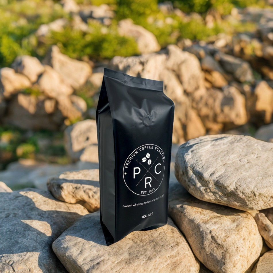
Allocating artwork across four panels requires a strategic approach based on how the product will be merchandised and handled by consumers.
Evaluating how the bag sits on different shelving types, whether at eye-level or on the bottom shelf, helps you design the side gussets to capture peripheral shopper attention. Leveraging the crisp, reinforced four-corner seals keeps the panels completely flat and taut. This physical stability prevents the sagging, slouching, and wrinkling common in standard stand-up pouches, ensuring printed branding and text remain clean and legible. If your product is heavy, the structural rigidity of the four corners ensures the front panel does not bulge outward, which can distort central graphics.
You need frameworks for organizing dense text on the back panel without violating minimum font size regulations or contrast requirements. Ensuring clear zones around critical data points prevents printing bleed or registration errors from obscuring legal text. Proper layout planning keeps the packaging compliant while maintaining a professional appearance. Use high-contrast color combinations for ingredient lists, and avoid placing small serif fonts over complex background patterns.
Placement strategies must ensure high-speed retail scanning. Avoid placing barcodes on the gusset folds or near the four corner seals where material warping can render codes unreadable. The flat back panel or the bottom gusset usually provides the most reliable scanning surfaces. Always print barcodes in a single, solid color—typically black—over a white background block to guarantee a high scan grade.
| Panel | Primary Function | Recommended Content | Design Constraints |
|---|---|---|---|
| Front Panel | Brand Attraction | Logos, Product Name, Key Claims | Keep text 5mm from corner seals |
| Back Panel | Compliance & Info | Nutrition Facts, Ingredients, Barcodes | Maintain high contrast for readability |
| Side Gussets | Peripheral Visibility | Vertical Logos, Secondary Claims | Account for inward fold when flat |
| Bottom Gusset | Utility & Tracking | Lot Codes, Expiration Dates, Recycling | Avoid printing across bottom seams |
Selecting the right printing technology depends heavily on your run size, artwork complexity, and material structure.
Gravure printing is best for ultra-high-volume runs requiring photo-realistic details, fine gradients, and exact Pantone color matching across all four panels, though it involves high initial cylinder tooling costs. Flexographic printing is the industry standard for medium-to-high volumes, offering excellent color consistency with lower plate costs than gravure. Modern flexographic presses can achieve line screens that rival gravure, making it a highly capable option for complex designs.
The standard multi-layer structure involves printing on the inside of a clear outer layer, typically PET, which is then laminated with an adhesive to a barrier layer like foil, metallized film, or PE. This process traps the ink layer, isolating it from both the packaged product and the consumer's hands, making the packaging scratch-proof, highly durable, and food-safe. It also protects the ink from scuffing during transit and provides a premium glossy or matte finish. When using metallized films, a layer of opaque white ink must be laid down first to ensure the top colors do not appear dull or metallic.
Digital presses are excellent for short-to-medium runs. Digital printing eliminates plate costs and allows for variable data printing, such as unique QR codes on every bag, across the printable area. This flexibility supports rapid market testing and seasonal promotions. However, digital printing may have limitations in matching specific Pantone spot colors compared to gravure or flexographic methods.
Brands must decide whether to print directly onto the film or use secondary labeling methods based on their operational flexibility and volume requirements.
Direct-to-film printing is ideal for mature product lines with stable artwork, high production volumes, and a requirement for 360-degree, edge-to-edge branding. It delivers the most professional and cohesive look for established retail products. Direct printing also eliminates the secondary step of label application, streamlining the packaging process on the filling line.
Applying Custom Sleeves and Labels to blank quad seal bags serves as a bridge strategy for market testing, seasonal variations, or localized compliance changes. However, labels cannot easily cover the side gussets without wrinkling, which reduces the effective branding area compared to direct printing. When using labels, ensure the adhesive is compatible with the surface tension of the pouch material to prevent peeling in cold or humid environments.
A comparative framework helps analyze the unit economics. Direct printing involves high setup costs but low unit costs, making it suitable for large runs. Labeling involves low setup costs but higher unit costs and manual or automated application labor, fitting better with smaller volumes. Brands often start with labeled stock bags for initial product launches and transition to custom-printed film once sales volumes justify the tooling investment.
Executing a four-panel design requires precise engineering to avoid common manufacturing defects.
There is a risk of placing critical text or logos too close to the four vertical corner seals or the top and bottom horizontal seals. Request exact dielines from the manufacturer and enforce strict safe zones, typically 5-10mm from any seal or fold, to prevent distortion. The heat applied during the sealing process can cause the film to shrink slightly, which will warp any graphics printed directly over the seal area.
The underlying barrier material, such as silver foil versus white PE, affects the final appearance of the ink. Utilize white ink underlays, known as spot white, to ensure color opacity and vibrancy on metallized films. Without a sufficient white underlay, colors will appear darker and lose their intended hue.
Aligning continuous graphics that wrap from the front panel to the side gusset presents a technical challenge. Design artwork with intentional breaks, solid color blocks, or overlapping bleed areas to mask minor registration shifts during the pouch-forming process. Avoid fine lines or continuous text that spans across the fold, as even a 1mm shift during manufacturing will make the design look misaligned.
A: While technically possible to have ink in the seal area, it is highly discouraged for critical artwork or text. The heat and pressure used to form the four corner seals can distort the imagery, and certain inks may interfere with the integrity of the seal itself.
A: A standard side gusset pouch typically has a back-center fin seal, which interrupts the printable area on the back panel. Quad seal bags move the seals to the four corners, providing a completely flat, uninterrupted back panel for printing.
A: Brands can purchase unprinted stock quad seal bags and apply custom sleeves and labels to the front and back panels. This is a cost-effective solution for short runs, though it sacrifices the ability to utilize the side gussets for branding.
A: Packaging manufacturers require vector-based artwork, typically in Adobe Illustrator (.AI) or layered PDF formats, mapped precisely to the provided dielines, with all fonts outlined and colors specified in CMYK or Pantone (PMS).
A: Yes. While it is not visible when the bag is standing on a shelf, the bottom gusset is fully printable and is frequently used for barcodes, expiration dates, lot numbers, or recycling information to keep the primary panels uncluttered.
A: Reverse printing traps the ink between a clear outer layer and an inner barrier layer. This not only protects the artwork from scratching and fading but allows brands to choose between high-gloss or soft-touch matte finishes based on the outer film selected.

